BACK
Parent Portal Redesign
Roles: Product Designer | UX Researcher | Information Architect
HYBRID
B2C
PORTAL

Convert the Parent Portal web app into a hybrid app - a single codebase for web, iOS, and Android.
In the process, redesign the Parent Portal home, navigation, and grades experience.
Incorporate mobile features like fingerprint authentication and push notifications while maintaining usability across various screen sizes.
Increase Parent Portal adoption.
Improve parent engagement.
Reduce student attrition.
Doubled total users
$10,000's saved
5,400 parent hours saved and counting!
Customer Quote
Very streamlined! Much better than having to go through the website to get to the portal! Thank you for developing this!!!
Discovery
Conduct user research
Define the problem
Visualize the problem
Design
Organize the information
Set aesthetic vision
Redesigned #1 feature: Grades
Development
Write user stories
Collaborate on trade-offs, feasibility, and technical constraints
See vision through to real world implementation
Exploratory research revealed varied attitudes about parent portals among parents:
I like that if I want to know how my kids are doing, I can find that out without having to interrupt the teacher. If I have a specific question, I can go here first without having to bother a teacher.
I really don’t care about seeing all the notifications. I just want to know if there’s a problem I need to address.
Finding out about my children’s poor grades on an assignment during the day while they’re at school just makes me upset before they get home.
Problem Statement
A parent of an NHA student who feels cheated out of their time and frustrated about intervening in their student's academics needs to log in to the Parent Portal but faces a non-native experience with a login wall.

Guiding Principle
Parents want to see their children front and center, and they want to quickly and easily get to their grades.
Conducting a content inventory on the Parent Portal revealed a natural organization. Using first principle thinking, I broke the content areas into their component parts, for instance:
Menu: Before

Menu: After

Student Specific Content
Grades
Attendance
Resources
Student Agnostic Content
Calendar
Volunteer
Email School
System Content
Settings
Notifications
Profile
Student Profile: Before

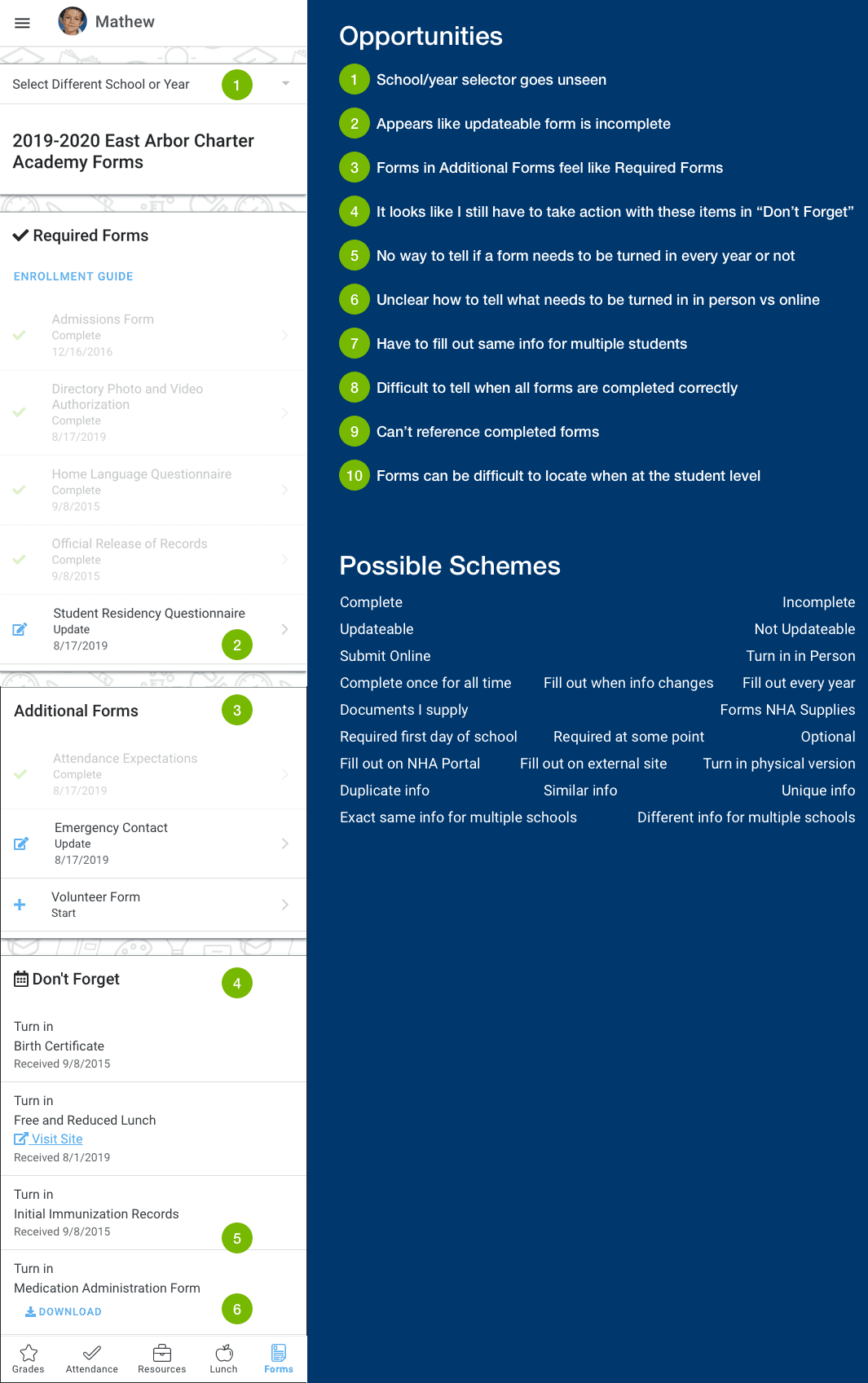
The old student profile was too visually noisy and distracting. Parents return to the Parent Portal to see grades. Wading through all the visual clutter caused extra cognitive burden. On top of that, grade details were buried four levels deep in the hierarchy.
I redesigned the grades summary to be the first thing you see when selecting a student, and made grades details just two levels deep. I moved the extraneous content into a tabbed navigation so it could be accessed when needed and be hidden when it wasn’t (which was most of the time).
Student Profile: After

I aimed for clean, clear, and highly usable. Where possible, show a child’s face. As a new parent myself, I knew parents simply don’t get tired of seeing their smiling children.
I tied everything together with a repeating background pattern, a thematic element present in the Parent Portal and the schools’ websites.
I did a complete redesign of the icon set to be more consistent and demand less attention. I added a card element with shadows to give the illusion of lifting the content off the screen. It was all about little touches that could make the content parents care about stand out.
The most important feature was grades. So I gave it extra attention. I started by understanding deeply the relationships of the parts through an entity relationship diagram.
Then I iterated until I got the look and feel just right.